From the amazing show of Kino no Tabi (Kino's journey) where I reviewed here, Kotobukiya made a figure of Kino together with Hermes. This is the first scale figure that features both Kino and Hermes.
Kino's box is fashioned in the style of a luggage trunk, which fits the theme of the anime a lot - where Kino travels around the world on her trusty motorbike, Hermes.
The trunk also has printouts of luggage stickers on it, which keeps to the theme. These stickers also cover the important information of the figure, allowing the collector to enjoy the information displayed in a visually appealing fashion.
Another special aspect of this figure is that the box is slightly different from most others. The front of the box is connected via Velcro and upon opening it, you see a huge window that displays the figure in all its splendor.
There are images of the figure, along with a description of the ARTFX J line, would seem like a new marketing strategy to get people on board Kotobukiya's fanbase and the ARTFX J line. The pictures also took care to showcase both of Kino's head parts - with and without her helmet.
This is a brief look at the blister she comes in. She has Hermes, a luggage pile that would be placed behind Kino on Hermes, a base that has a field of red flowers lining a sandy dirt path, a loose flower piece and, as mentioned before, a second interchangeable head. This interchangeable head is also a first release bonus, and any future releases would not contain this extra part.
The instruction sheet for this figure is also in the theme of the the show, replicated as a letter sent from Kotobukiya's head office to the collector.
Even the little red seal that's used at the back of the letter is in place, keeping it as authentic as possible. That being said, the letter can be unfolded to get a full instruction sheet.
The base of this figure is a very good diorama that ties the figure together.
All the aspects of the diorama base - the red flowers, the green grass and the dirt sand - are carefully textured and comes with small indentations to fit the different parts of the figure to. However, as there are no pegs, the figure would simply be placed on the base loosely.
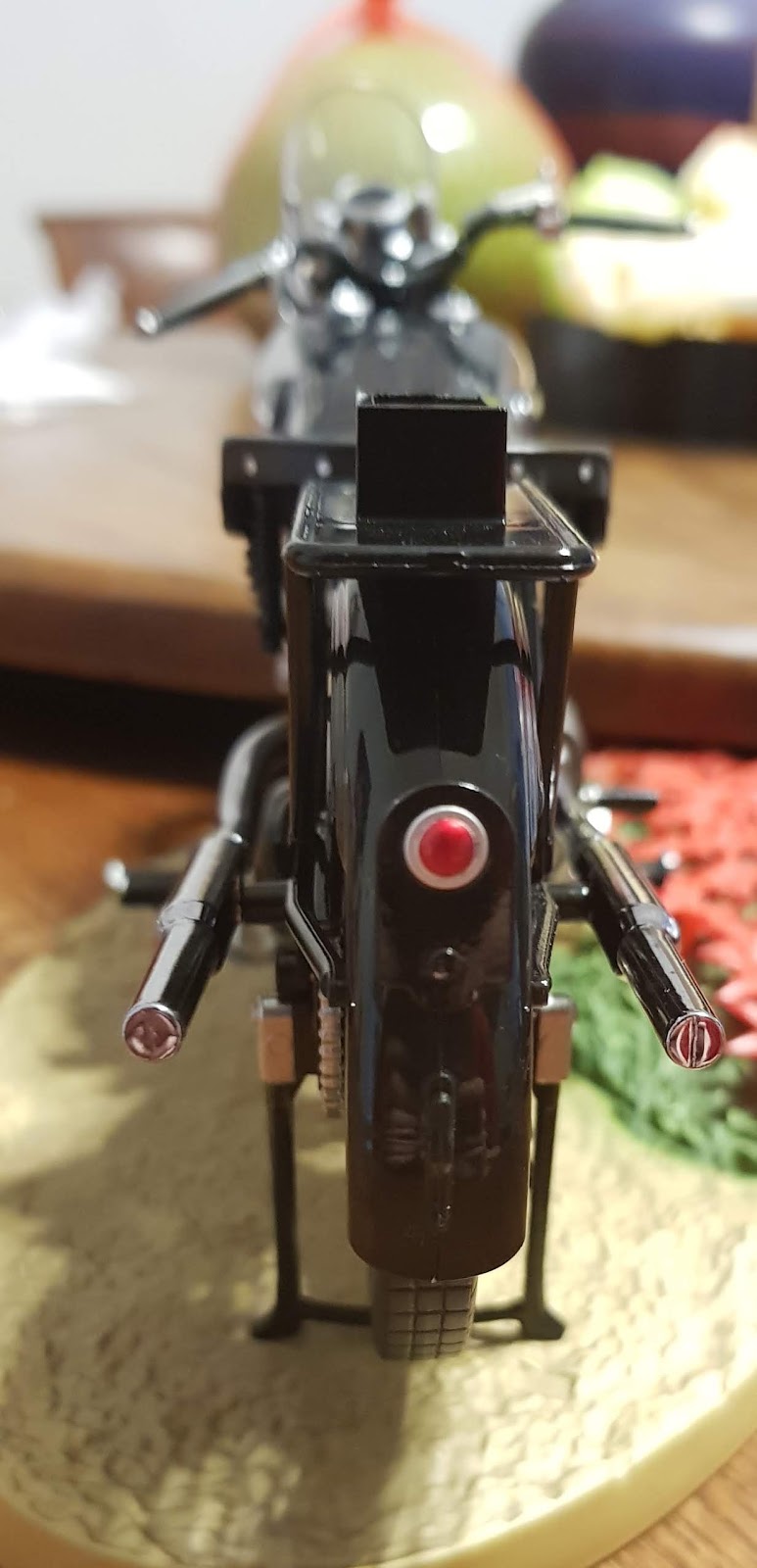
Hermes fits perfectly into these indentations and is thus able to balance on the base. In this figure Hermes is larger than Kino and it is evident that a lot more effort and thought was placed into sculpting and painting Hermes.
Even the wheels are delicately sculpted and painted in different colors and textures to make it look as realistic as possible!
This peg directly above the the back wheel and is for securing the luggage trunks that Kino is bringing along with her for the journey. Next, let's take a look at the luggage trunks that are supposed to be placed on the peg.
The trunks are sculpted with perfectly straight edges and impeccable detailing. The cloth bundles are sculpted simply, with soft edges and a carefully rolled-up look. However shading is minimal for the cloth and the two black straps holding it in place.
Kino comes with an alternate head without her helmet. This helps to create a carefree feel for the figure, however, it's easy to see that a lot less effort has been placed into sculpting and painting Kino as compared to Hermes. The tips of Kino's hair is a lot less sharper than the other figures in Kotobukiya's ARTFX J line. The color chosen for painting Kino's hair and eyes are on-point but there is minimal shading for her hair.
The paintwork for Kino's head with the helmet is a lot better as there are more elements that Kotobukiya can work details into.
The white parts of the helmet are textured with fur while the rest of the green areas are sculpted and painted with a smooth finish to resemble cloth.
The goggles at the front of Kino's cap is also painted delicately with no paint spills.
All in all, I feel that Kino looks a lot sharper with her helmet on. The sculpt of her slim build is also accurate to the series.
The belt cuffs at her wrists and ankles are not as well painted and shaded and appears as a one-tone coloring. There seems to be a little spillover of green from her outfit as well. On the other hand, her shoes seem to be well sculpted, with all the laces carefully sculpted and layered one above another. The shoes are also painted with a rather matte shade that brings her look together.
The way her coat bunches above the belt on her waistline is realistic and the way it flares out after is also adequate for her pose. The belt on her waist however, isn't shaded sufficiently but accentuated with gold accents that helps to add enough to the accessories without overshadowing it.
All the different revolver components at her belt is more visible from the back and all of them are strapped in a way that makes it easier for her to retrieve the weapons when needed. This is also reflected well in the 3D rendition.
The stray flower can be placed anywhere on the base. The stalk uses a lively green color that reflects the succulence of the stem and leaves. However, the red petals of the flower could use a lot more detailing. All in all, this figure is well-made due to the thought placed into sculpting and painting Hermes. If you take Hermes as the main star or the co-star of this figure, it would be appropriate and worthwhile to get this figure. However, if you wish to get a figure of Kino as the star, the difference in quality of work on Hermes and Kino would make it a figure that isn't worthwhile to get.
It's Shimamu from Idolm@ster Cinderella Girls! This is a figure by Good Smile Company, that was released some time ago. I got it second hand from Amiami's pre-owned section on a previous trip to Tokyo.
The box for Shimamu has a simple pattern with dots in different shades of teal. Pink sparkles are also spaced out evenly all over the box to bring out that magical sparkle of idols.
The blister gives a simple indication of what the figure entails - Shimamu herself and a simple circle base. She does not come with any additional parts or attachments, hence assembling is a simple process.
The base itself is inspired by a clock with roman numerals, tying it close to the aspect of "Cinderella". While I applaud Good Smile Company on the concept for the base, I felt like the color scheme could have been much better. The circle base itself in in a creamy white color, that's not fully opaque yet not see-through enough to be labelled as translucent either. The pink detailing on this base's color is rather obscure and faint in contrast with the sharp yellow roman numerals. Personally, I don't find this contrast appealing.
The neon yellow numerals forming a small circle around Shimamu's soles stand out quite a bit when viewed from a higher angle. Like I mentioned previously, this isn't a contrast I like. Shimamu's color palette is more of a pastel color and softer on the eye.
A simple 360 of the figure shows the different angles of the figure and showcases the different layers and components of her outfit.
Her hair is sculpted delicately and even with her thick hair, all the different bunches are delicately sculpted and painted. Some of them are even sculpted to twirl in a different direction to add volume to her hair!
The hair seam is also cleverly concealed with her hair style too! The way her outfit flares out is really cute too and I love how the inner and outer sides of her outfit has two different colors.
Shimamu's pose is very idol-esque, probably framing a scene with her hands outstretched in a middle of her song and dance. While I find that this pose looks rather good from the side-view, it looks a little awkward from the front, especially if you view the figure at eye-level.
Her arms are slightly lowered instead of being outstretched straight out in front of her. This probably fits the impression that she is striking this pose to fans, who would inevitably be mostly seated on a lower ground than the platform she is on. However, this is rather an awkward pose when taken out of context.
Her outfit is really detailed, with a myriad of colors accentuating the cream and blues on her dress. The brown tassels around her waistband fit with the matte color scheme on her attire, however those tassels on her shoulders seem a little too dull. I wished that they would use a brighter gold shade, similar to that encasing her heart shaped brooch.
Small details on this dress really pull the look together. There are several heart-shaped accents on her outfit, such as the brooch on her chest and this cute little piece to hold her attire together.
Similar to her dress, her shoes also have heart-shaped embellishments covered in gold paint. Her blue shoes have a slight design to them, however the sculpts are rather rough looking. I wish that they put in a little more effort into defining her shoes.
Her stockings are white and adorned with a red heart on the outside of her thighs add to her outfit. The back of her knees and ankles are also shaded lightly to add dimensions to the figure.
Additional details that are easily overlooked are like this symbol at the front of her glove, which is typically hidden due to her pose.
Another noteworthy aspect is that there are small gold heart accents at the tips of her dress. However, I wish that the transition would be smoother. There are a lot of good points about this figure, but I find that the hands in the pose is awkwardly positioned, and the cream color of her attire doesn't fit the pristine white look I have in mind for a cutesy idol. Hence, I think that there should be a lot of other good Shimamu figures that you could get at the same price, with better sculpting and posing that would fit Shimamu better. ~ Reina-rin
Last night, comic fans and media friends were invited for a private event "SGCC FAN-TASTIC Journey Fan Gathering" at the NINETEEN80 bar along Tanjong Pagar Road. The atmosphere reeked of retro olden days with rows of arcade game machines such as Space Invaders, Streetfighter, etc. I loved the giant poster board of colourful comic illustration just on top of the main sofa area.
I was taken by surprised when the instance I signed my attendance, a large bag of comic-memorabilia filled goodies was handed to me. And every of the 25 fans and media friends received one as well. The dinner buffet was sumptuous but I had eaten a little earlier in KidZania for our Milkcananime booth.
Along with some "Q & A" and charade games, generous prizes giveaway (including a Thor statue. Gaming Computer and a free ticket to New York Comic Con), organisers from Reed Exhibitions made three important announcements. First, the popular Singapore Toy Game and Comic Convention (STGCC) will be re-branded as Singapore Comic Convention (SGCC). The predecessor name is a tad mouthful to pronounce and the new name is shorter. But that does not mean the content of the exhibition will change; toys and games will still be a part of the annual event. Also the new name is consistent with some of its larger siblings such as the New York Comic Con in the US. (The acronym is SGCC and not SCC where SG is better known for a popular representation of Singapore) Next, the venue for the Singapore Comic Convention, traditionally held in Marina Bay Sands Expo & Convention Centre will be relocated from the basement to the 1st floor. This will no doubt increase the visibility and efficiency of logistical needs of all the exhibitors and vendors. We can expect a spillover effect from tourists when they see myriad of Cosplayers from the Action-Heros to kawaii Lolis parading the floor. Finally, the dates for the SCC will be moved forward to 7 & 8 December 2019. If you remember, the annual comic fest is always held in September. I feel the shift to a later date has its pros and cons. If you remember in 2017, Chara Expo and STGCC held its events exactly on the same weekend. To most fans, it means you either choose A or B. The new decision is a clever move, albeit overdue. Also, SCC can tap on the synergy with the two industry events "Screen Singapore" and "Asia TV Forum" which are held around the same period. However; given that Singaporeans love to fly their family for overseas holiday during December, we will have to wait and see if indeed the newly re-branded Singapore Comic Con is a right strategic move by Reed. Written by Max Wong